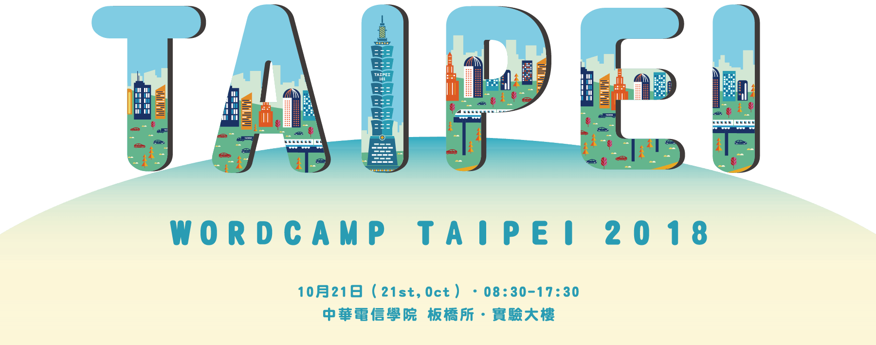
Taipei 是台灣的首都,其實更是國際之都。
這次 WordCamp Taipei 2018 網站主視覺當然也是用「TAIPEI」字體為主題,除了對所有人傳達這個城市的繁榮與活潑外,也同樣表示我們邀請全球 WordPress 的夥伴一同來到「TAIPEI」這個地方共同參與 WordCamp Taipei。
主視覺設計理念:
以「TAIPEI」字母的輪廓作延伸,將台北著名建築物、便捷的捷運系統、與繁華的城市樣貌融入其中。
設計師:Fan Apple
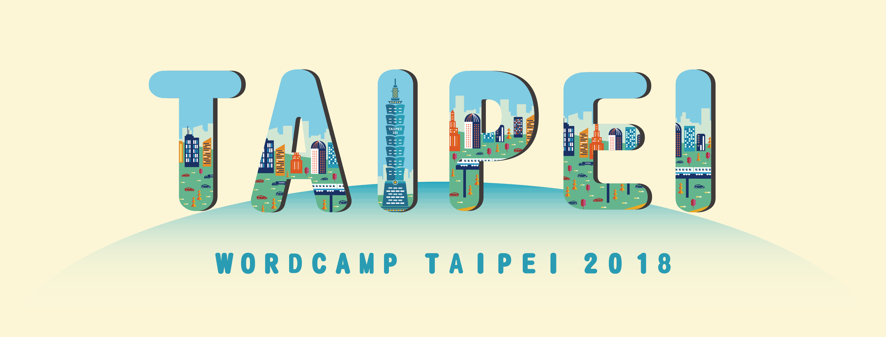
Taipei is the capital of Taiwan, also a modern and fully internationalized city.
The main visual of the WordCamp Taipei 2018 website addresses the theme of TAIPEI, highlighting the prosperity and vigor of the city, as well as its hospitality offering warm welcomes to WordPress partners from all over the world.
The main visual design concept:
With the image of the well-known Taipei building, the remarkable Taipei Metro system, and the energetic atmosphere all converged on the scene and fit in the letters “TAIPEI”, the main visual design demonstrates the inherent diversity and creativity of the city.
Designer: Fan Apple
棒棒~ 謝謝 Apple 與我們 WordCamp Taipei 設計組夥伴